Marco Catalog
,Project Description
Understanding the Objectives: Before starting the redesign process, it was important to collaborate with Marco’s marketing team, design team, and executives to understand their goals and requirements. The objective was to create a modern and forward-thinking catalog design while staying true to the brand and appealing to their target audience.
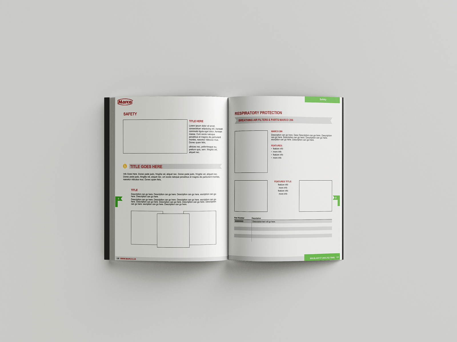
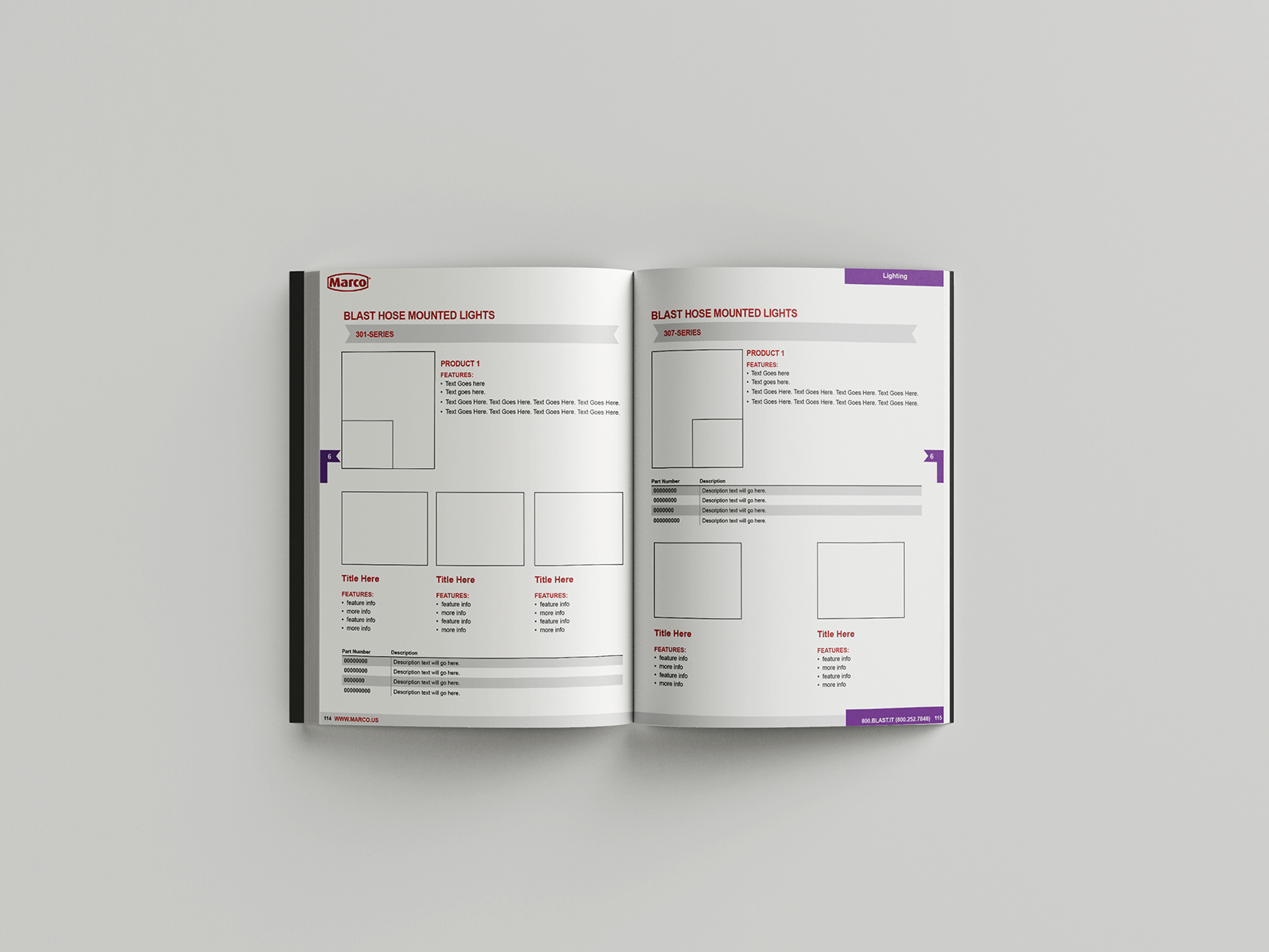
Wireframing: To establish a strong foundation for the catalog’s user experience (UX), wireframes were created. These wireframes acted as visual blueprints, outlining the layout, structure, and interactions of the catalog’s pages. The wireframes served as a guide for the subsequent design process.
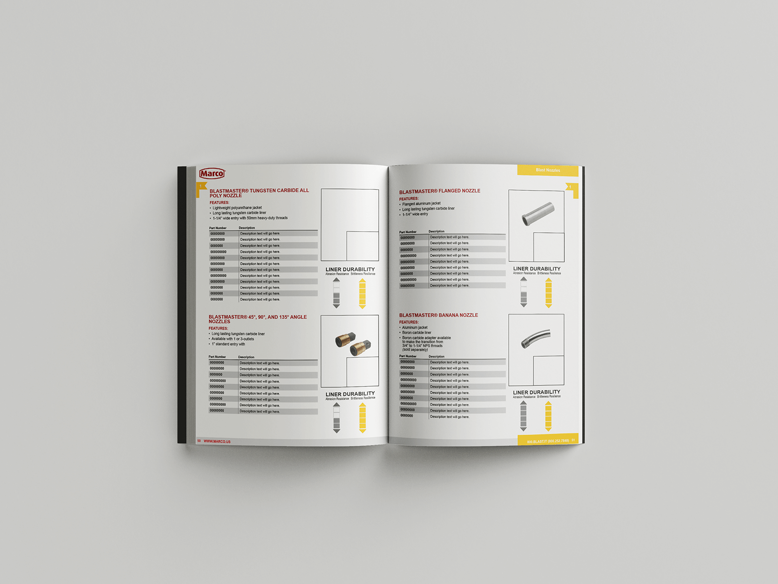
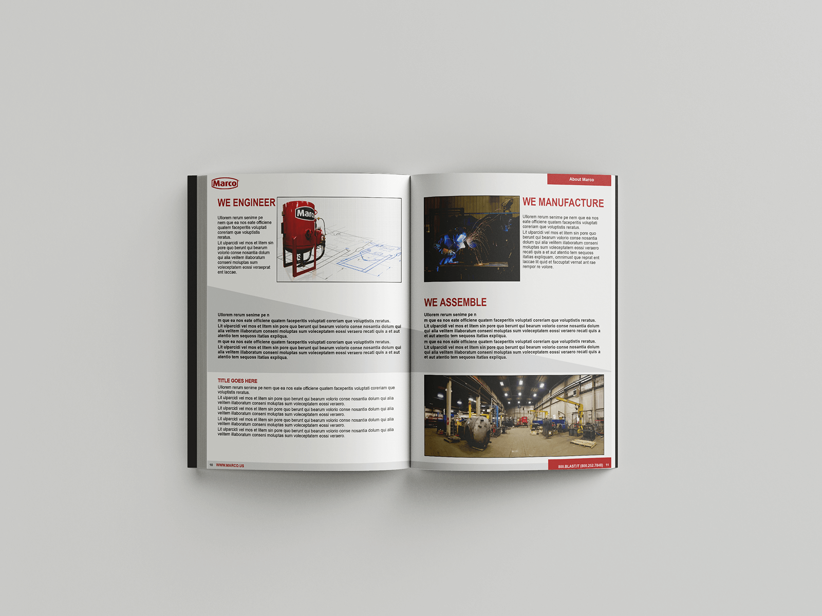
Design Mockups: In addition to wireframes, specific sections of the catalog were given special attention. Design mockups were created for these sections to showcase the envisioned visual style and aesthetic. These mockups provided a glimpse into how the final design would look, ensuring alignment with the desired modern and forward-thinking approach.
On-Site Product Photography: To enhance the visual appeal of the catalog, on-site product photography was conducted. This involved visiting Marco’s premises and capturing high-quality images of their products. The new product images aimed to give the catalog a fresh and contemporary look, contributing to its overall modern and appealing aesthetic.
Catalog Redesign: Based on the wireframes, design mockups, and the newly captured product images, the catalog was redesigned from the ground up. The 600+ page catalog underwent a comprehensive transformation to align with the desired objectives. The redesign incorporated modern design elements, intuitive navigation, and an overall improved user experience.
Throughout the project, close collaboration and feedback loops with Marco’s marketing team, design team, and executives ensured that the catalog’s redesign achieved the desired balance between modern, forward-thinking design and brand appeal.
Note: If you have specific questions or need further assistance with any aspect of the case study, feel free to ask!
Skills
UX Design
Wireframing
Graphic Design
Studies and Wireframes
When creating wireframes for the catalog redesign project, the focus was on developing unique wireframes for each section and subsection. This allowed for a detailed visualization of the layout, structure, and content placement of the catalog pages.
To gather inspiration and insights, the design team reviewed several competitors’ catalogs as well as non-competing catalogs. These sources provided valuable ideas for design elements, content organization, and overall user experience. The aim was to take inspiration from successful catalog designs while ensuring that the final result remained distinct and aligned with Marco’s brand identity.
After the wireframes were created, Marco’s design and marketing team took charge of incorporating images and copy into the catalog. The wireframes served as a guide for these teams to understand the intended layout and structure, ensuring consistency across the catalog’s design.
Custom Design To Inspire
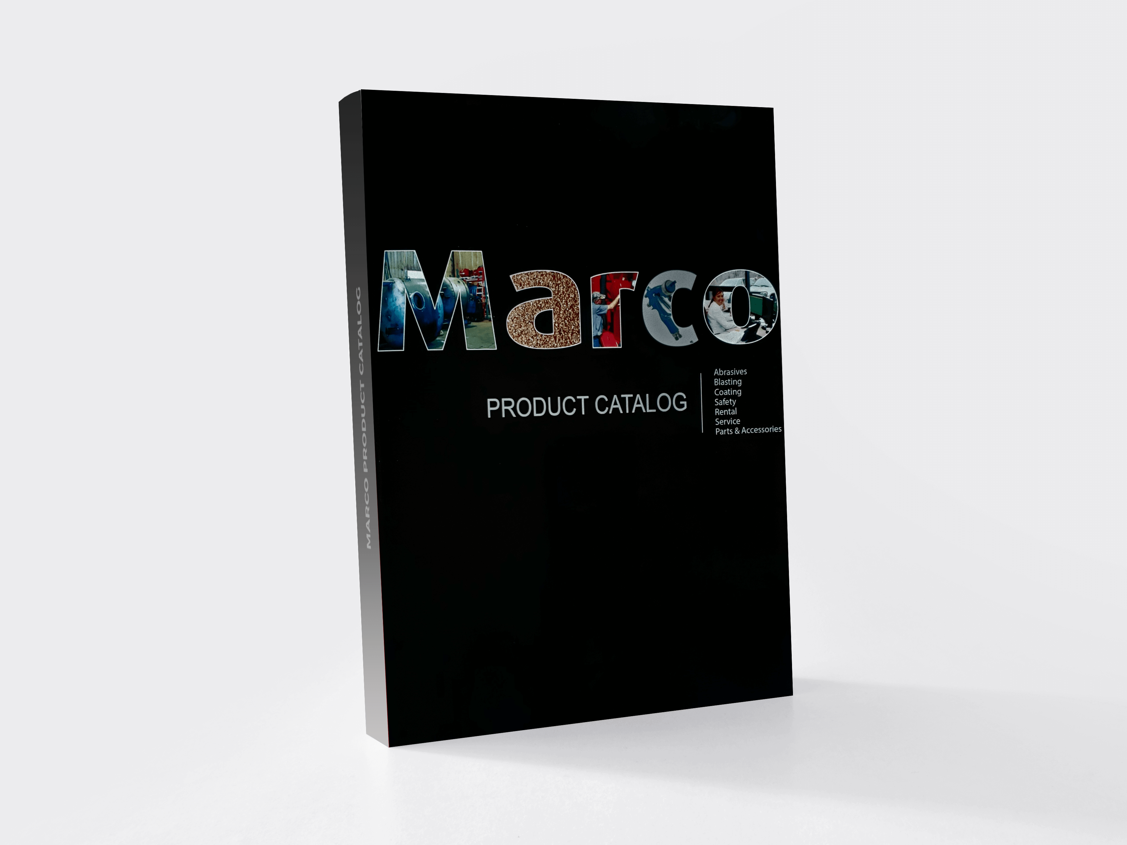
Our team was given the task of integrating product images into various pages of the catalog, and we wanted to create a visually inspiring design. To achieve this, we developed unique custom designs for each section, as well as the front cover and back cover.
By incorporating product images, we aimed to enhance the overall visual appeal and engagement of the catalog. Our custom designs carefully showcased the products in a visually appealing and impactful manner. We paid attention to details such as image placement, typography, color schemes, and graphic elements to ensure a cohesive and visually pleasing design.
Each section of the catalog had its own custom design, tailored to the specific content and theme of that section. This approach allowed for consistency while providing variation and differentiation between different sections.
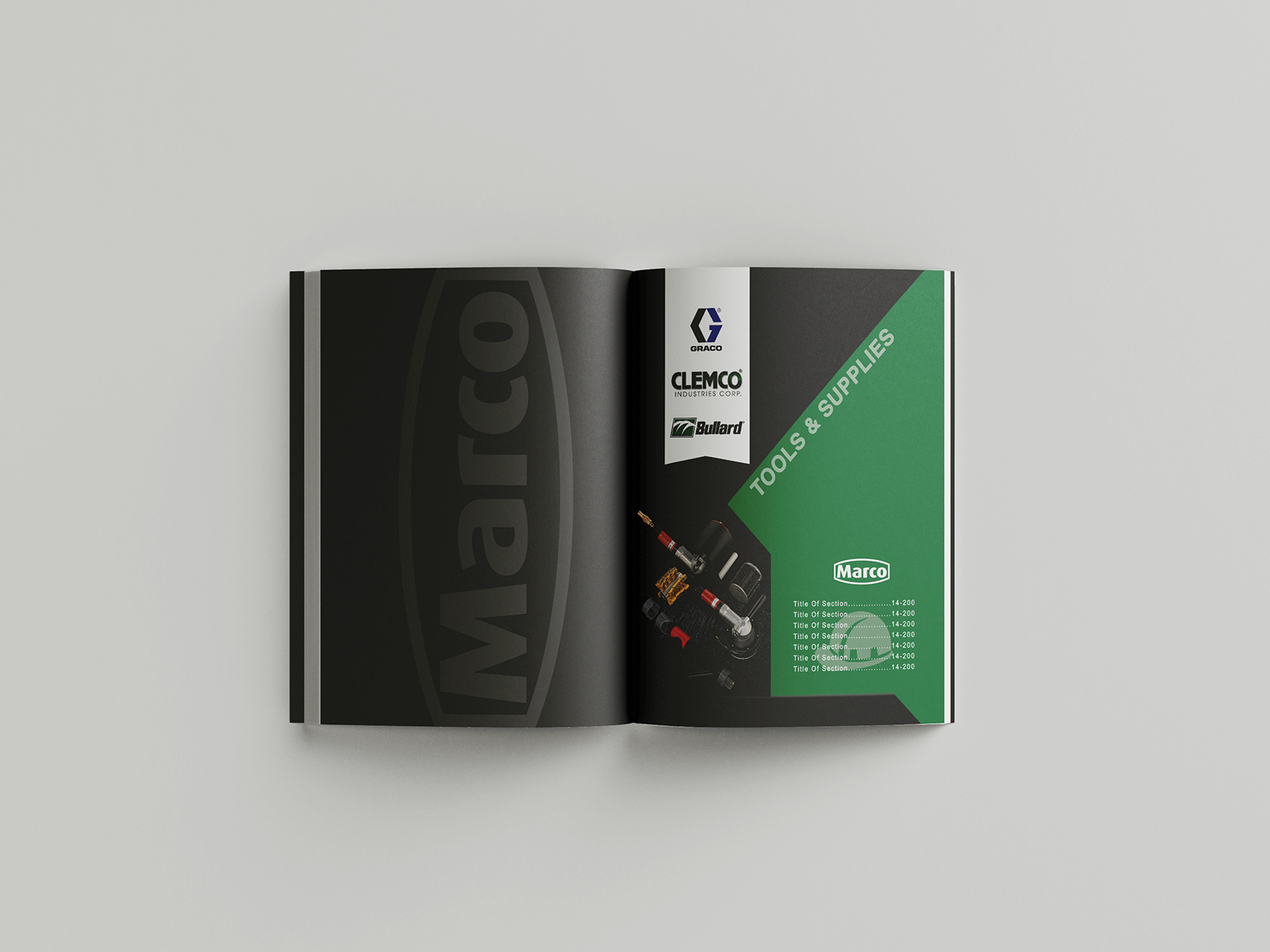
The front cover and back cover of the catalog received special attention, as they serve as the first and last impressions. Our custom designs for these covers were created to captivate attention, reflect the brand’s identity, and spark curiosity, encouraging readers to explore the catalog further.
Once we completed the custom designs, we handed them off to Marco’s design team. These designs were meant to inspire and guide their work going forward. We hoped that our designs would serve as a starting point, allowing their design team to leverage their expertise and creativity to refine and finalize the catalog’s visual aesthetics.
By providing custom designs for each section and covers, we aimed to inspire Marco’s design team and ensure a visually appealing and engaging catalog.
If you have any further questions or need additional information, feel free to let me know.
A Colorful Index
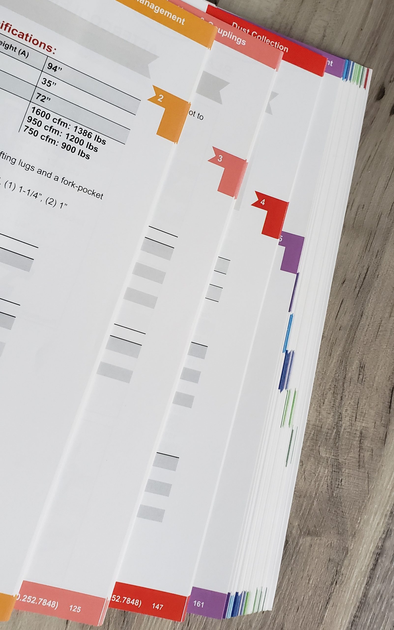
In the catalog redesign project, one of our objectives was to create a visually striking and memorable index. We approached the design of the index with three key concepts in mind: bright, cheerful, and modern.
Using wireframing techniques, we laid out the structure and layout of the index to ensure intuitive navigation and easy access to the catalog’s content. With the wireframe as our foundation, we then proceeded to design the index, incorporating the desired concepts.
To achieve a bright and cheerful aesthetic, we employed vibrant colors that would catch the reader’s attention and create a positive visual impact. The color palette was carefully selected to evoke feelings of energy, excitement, and joy.
In addition to color, we focused on creating a modern design for the index. This involved employing contemporary design elements such as clean typography, sleek lines, and balanced composition. The goal was to give the index a fresh and up-to-date look that would resonate with the target audience.
By combining these elements, we successfully accomplished our goal of designing a colorful index that stands out and leaves a lasting impression on readers. The bright and cheerful visuals, along with the modern design approach, ensured that the index not only served its functional purpose but also enhanced the overall user experience of the catalog.
If you have any further questions or would like more information, please feel free to ask.
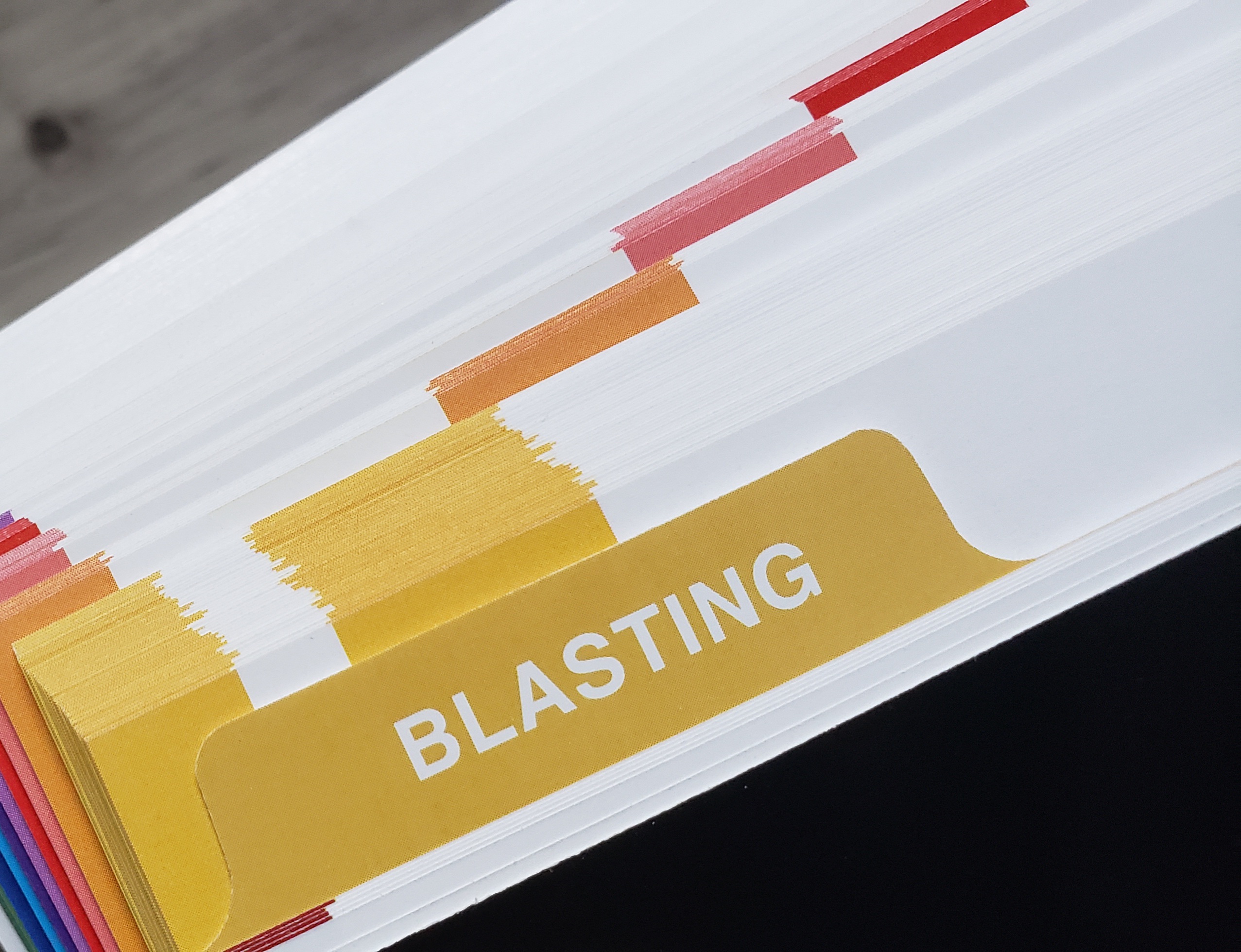
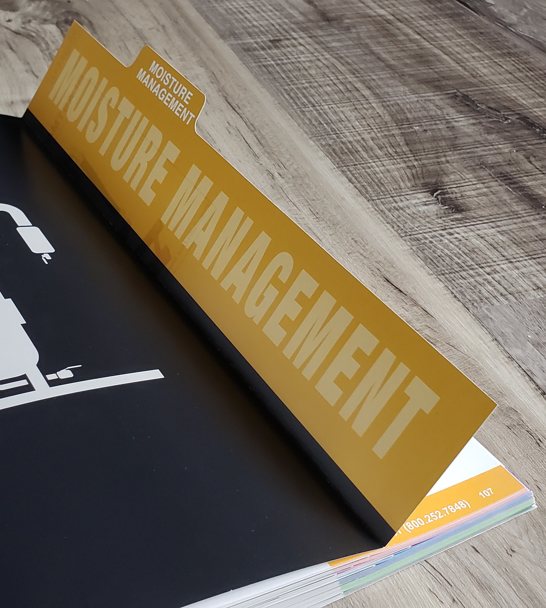
Tabs fold in and out so that the user can choose which sections to prioritze. This speeds up finding products for the user.

About Janie Giltner
Owner
As a Quad City-based website designer, I specialize in a wide range of creative services, including graphic design, website design, branding, photography, and illustration. My expertise extends to clients both locally in the Quad Cities and worldwide.
With a diverse client roster spanning the globe, my work has been featured in prominent print and web publications. I bring a wealth of experience and a keen eye for detail to every project, ensuring that your vision is brought to life with exceptional craftsmanship.
Whether you need a stunning website that captivates your audience, a distinctive brand identity that sets you apart, visually compelling graphics, captivating photography, or unique illustrations, I have the skills and expertise to deliver exceptional results.
Choose a Quad City website designer with a global reach, serving clients in the Quad Cities and surrounding areas. Let me bring your creative vision to life and help you make a lasting impact in both the online and offline worlds.

